Emily Bray shares her musings on this years crop of Christmas Ads.
It’s the most wonderful time of the year and that means the festive floodgates have inevitably opened, unleashing a pyroclastic-flow of nauseating Christmas adverts. They come every year like an uncontrollable weepy, kitschy, festive flu that just won’t quit. Really John Lewis is to blame for this commercial pandemic - as the fervour kicked off circa 2011 with this #toocute spot. Perhaps I wasn’t paying enough attention to the ad scene pre 2010, but I’m pretty sure no one gave a monkeys about Christmas ads before.However, since this Merry D-Day of advertising each year brings the Battle of the Brands, in which big names pump an obscene amount of money into creating ‘feel good’ moments, to persuade you to buy your Granny a lamp or a phone contract or something else she really doesn’t want. Sorry if I sound like the Grinch - I really do like some of them, but I think the whole thing has got slightly out of hand. Losing sight of what Christmas is really about, the yearly stand off has lead to brands pumping cash into trying to outdo each other - rather than work that is really authentic.
Sainsburys
The biggest culprit is Sainsburys with their heinous black and white sing-a-long creation, complete with bouncing sprout (WTF?) The whole thing is atrocious - did no one tell them that user generated content is SO 2015? This ad is not only painful to watch, but exceptionally tacky and their chosen sing-a-long tune isn’t even catchy. It is a far cry from their elegant and profound First World War piece from a couple of years ago. Their change of agency has had a clear impact - and it is definitely not a good one.
Very
Next on my list is online retailer Very. Does anyone remember any work that Very has ever produced? No. Now don’t get me wrong, I respect that they have thrown their hat in the ring and tried to run with the big boys - but the result is a misplaced, if beautiful, mess. Their piece takes place in a CGI Winter Wonderland with a girl who wouldn’t look out of place in Frozen, desperate to gift those on her extensive list. Now, aside from the fact that this is clearly ripped off from John Lewis’ ‘The Long Wait’ (see above on JL’s 2011 spot) - it has nothing linking it back to the brand, no product and nothing to build on their brand identity. It is a bold piece of work - but feels like they are simply trying to keep up, rather than creating anything that is actually on brand, or speaks to their customers.
John Lewis
These guys are a victim of their own success. Having sat fat and happy at the top of the Christmas ad hierarchy for the last few years, it appears that they are slowly losing their sparkle. Nothing good can last forever and Moz seems much more forced than his predecessors - and he’s not even that cute. The soundtrack isn’t memorable, the story doesn’t tug on the heart strings (and probably not the purse strings), sadly it doesn't have the pizzazz of adverts past. It might be time for a change in direction.
Anyway - enough of my rant.
Here are some spots that you should actually take some time to have a peek at (if you can find time in between scoffing mince pies and downing mulled wine):
Age UK
Weepy - but not because it’s cute. Age UK draws attention to the forgotten at Christmas time, reminding us that everything is not merry for the thousands of elderly who are alone on Christmas. You probably won’t enjoy it - but it’s a powerful piece of work.
BBC
This stop motion beauty doesn’t try too hard. A young girl rehearses for a Christmas talent show, while her dad busy with work doesn’t pay any attention. Totally charming.
M&S
Aside from the fact that M&S are obviously jumping on the Paddington bandwagon as a means to their own ends - I can’t help but love it’s twist on Father Christmas. Anything with this little bear gets a thumbs up from me.
Debenhams
A modern day fairy tale - with Ewan McGregor. What’s not to like? It’s glossy and festive - a great job.
McDonald’s
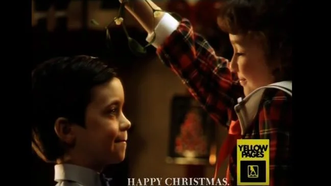
Ok, I am totally biased - but McDonald’s have done a very clever thing here. Rather than focusing on their glorious menu, they have made their ad all about one girl’s quest to find carrots for Father Christmas’s reindeer - cementing the brand as a go-to for anything and everything over the festive period. Sweet without being saccharine, it places brand at the heart.So there you have it - now we can all get on and enjoy Christmas, without having it rammed down our throats.If you really want to see what a Christmas ad should look like, in my humble opinion, watch this flawless 90s spot from Yellow Pages, no muss, no fuss - a simple idea, well executed with product front and centre and not an animal, CGI or otherwise, in sight.
[email-subscribers namefield="NO" desc="Please follow us for all updates :-) 💕" group="Public"]


